Frequently Asked Questions - Hazard Map
August 14, 2007
I have been receiving questions from fellow colleagues well as the public concerning the Hazard Map. I have compiled a list of a few relevant questions and have included answers for your reading pleasure.
-Landon Silla, Manager of Information and Technology
Q: I’m a little confused, can you please explain how to use the basic functions of the Hazard Map
A: No problem. Here is a brief rundown of the controls. All of the major input controls are on the top row immediately above the map. The map loads centered on the prime meridian and equator at the highest level zoom (zoom level 1). You can click the magnifying glasses to zoom in and out. Currently there are a maximum of 5 zoom levels, though 9 (possibly 10) are planned to come in the future.
You can rollover the boxes to configure what is viewable on the map. The Sealevel Rise box controls what sealevel rise is viewable. The Earthquakes box toggles which historical earthquakes to plot on the map. You have the option of seeing none of the earthquakes, all of the earthquakes, all of the earthquakes from a given decade (1960’s for example), or all the earthquakes within a given magnitude range (6.0-6.9 for example). The Labels box enables you to print geographical text on the map in the form of city names and country names. City names are black with a white border and country names are white with black borders. The Heritage Sites box enables you to view heritage sites overlain on the map. We show two types of sites, ones we have documented, and ones we have not. Finally, you can enter in a search query in the Search box. Your query can search for a country, a city or a heritage site (documented, or undocumented). We return five matches per category.
The actual map works similarly to many other map applications. You can drag the map to recenter the map on a place of your choice. You can double click on an area to zoom in on that area. You can right double click to zoom out on a specific area. And you can use your scroll wheel to zoom in and out as well.
Clicking Link to this Page at the bottom provides you with a url in your address bar that you can copy/paste to get back to a specific view. The print option will create a giant high resolution image of your current view which you can use.
Q: There are so many colors on the map, what does all of it mean?
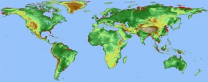
We tried to make the map as full of information as possible, so you are correct in noting there is much information to digest. I will start at the bottom layer in the map and move up. The actual color of the continents is a function of the elevation at that spot. The colors range from dark green (lowest elevation) to light green, to yellow, to brown to white (highest elevations). After selecting a sea level rise, the map will be redrawn with the inundated areas colored bright red. Toggling earthquakes is slightly more complicated. They are drawn on the map in the form of colored circles. High magnitude earthquakes are drawn as larger red circles whereas less severe earthquakes are drawn as smaller yellow circles. You can also toggle city and country names on and off.
On top of the map, you have the option of displaying certain heritage sites around the world. Undocumented sites will show up as blue pushpins and CyArk documented sites will show up as orange arrows. Rolling your mouse over these icons will show you the names of the sites and clicking on the icon will open a box revealing more information about that site.
Q: So I see that flooding and earthquakes are serious threats to heritage sites. Are you saying that those are the only things threatening them?
A: Not at all actually, there are many other risks threatening heritage sites out there, fire, political, drought to name a few. However, earthquakes and sea level rise have the particular trait of being very quantifiable at a given location. Other risks are perhaps subjective or change over time and thus difficult to plot on a map. If you have any data that you would like to see on this map, please contact me.
Q: How can I view more information about the heritage sites on the map?
A: Toggling the heritage sites on will display a multitude of icons on the map. Clicking on those icons will bring up a small box in the bottom right which will show more information concerning that particular site. If the site is a CyArk Documented Site and you click on the title, you would be forwarded to the archive page for that site. If the site is not a CyArk Documented Site and you click on the site, you will be prompted for your input to let us know why or how this site is important.
There are many sites out there and we are currently working on adding images and descriptions to all sites.
Q: Why does it seem that there are more earthquakes now compared with the beginning of the 20th century?
A: Do not be alarmed, the world isn’t going to crack apart just yet. Better technology has allowed for the recording of more earthquakes later in the past century. The bottom line is that there were (probably) just as many earthquakes at the beginning of the century as now, we just didn’t have the technology to record all of them.
Q: Wow, some of these views are pretty high in resolution. Where did you get this data?
A: In 2000, NASA launched their Shuttle Radar Topography Mission (SRTM3) that documented the topological data for most of the globe. The mission obtained elevation information sampled at every 3 arc-seconds which is about 90 meters. So with this information (about 50 gigabytes worth), I was able to calculate what sea level rise would be needed for every given point on the planet to be inundated, which was no small task.
The one major hang up with this data is that it only provided data for the parts of the planet between 60 degrees north and 60 degrees south. This left out Antarctica in the south and much of Canada, Scandinavia and Russia. Determined not to let my polar friends down, I was able to use different data. NASA ran a similar GTOPO30 mission in 1996 which basically did the same thing but was 10 times lower in resolution sampling the elevation at 30 arc-second intervals or about 900 meters. This data was able to be incorporated into the other high resolution data rather seamlessly.
Further, we acquired the earthquake data from the USGS. The raw data can be obtained here.
Q: How accurate is this information? Are these just educated guesses where the sealevel will rise to? Or was your process a little more scientific than that?
A: The short answer, they are very accurate. As noted above, the exact elevations of every point on the globe was provided by NASA and thus the accuracy of this application is contingent on the accuracy of NASA’s data. Every pixel on your screen at any view was calculated independently to provide the highest level of accuracy. So for a given point to be underwater at an x meter rise, that point has to be below x meters in elevation AND there has to be a path from that point to the ocean that is all below x meters. Both of those criteria were used in our calculations. However, that being said, there are still minor possible sources of inaccuracy.
First, the data NASA provided wasn’t entirely complete. About one out of 1000 points had an error value for the height. I resolved that by using a known neighbor’s height as the missing height. Another issue that needs to be considered is the tide. Tide magnitude ranges greatly depending on the lunar cycle, the time of year and the location on the planet. It is noted that the tide can have up to 12 meter swings. Third, the costal regions are not entirely immutable, for better or worse. A negative is the possibility of erosion. Above current sea levels, the land is generally rather weak and would not stand up to the forces of the ocean and would erode quickly. On the other hand, costal defense such as dams and locks could be created to protect low lying, populated costal areas. Finally, the accuracy of the NASA data has to be considered. The data unfortunately did not differentiate between the ocean (at 0 meters of elevation) and a point on a continent at an elevation of zero meters of elevation. This resulted in sea level rises accidentally coming from land locked areas of zero meters of elevation. Any red blotch should obviously have a path to the ocean. However, there are a handful of errors that exist. However, more often than not, those apparent errors do have a very tiny but very real path to the ocean.
Q: This doesn’t seem to be as fast as Google maps, what’s the deal with that?
A: Well there are three factors contributing to the latency of tile loading. First and foremost, our tiles are much richer in color than Google’s. We display elevation data in the form of variable color which results in large file sizes. They could have been made smaller and thus quicker to load, but we felt that the richness of the colors was just too cool to give up. Second, when requesting earthquake data or city/country labels, those tiles need to be created dynamically before they are sent to your browser. Once they are created, they are cached for the next request, but because of the high amount of permutations possible with all the different options, there are many possible images that can be displayed. Lastly, being a non-profit organization, we do not have the means to utilize massive amounts of hardware and our server response time suffers ever so slightly as a result.
Despite this, we feel that that we should provide you as much data and information as possible even at the cost of slightly slower load times.
Q: All of this information is very scary. How quickly is the sea level rising? Is the world coming to an end?
A: In our lifetime … probably not. Though I cannot see into the future, the sea level is rising at a slow but steady rate. If you are interested, please read more about this issue. However, you are most assuredly correct in your statement that this is indeed a scary matter.
Q: I have a question that’s not on this list, what do I do?
A: Please send me your question via a comment below and I will respond quickly. Or, if you rather, feel free to email me.
Landon Silla
Manager of Information and Technology
-Landon Silla, Manager of Information and Technology
Q: I’m a little confused, can you please explain how to use the basic functions of the Hazard Map
A: No problem. Here is a brief rundown of the controls. All of the major input controls are on the top row immediately above the map. The map loads centered on the prime meridian and equator at the highest level zoom (zoom level 1). You can click the magnifying glasses to zoom in and out. Currently there are a maximum of 5 zoom levels, though 9 (possibly 10) are planned to come in the future.
You can rollover the boxes to configure what is viewable on the map. The Sealevel Rise box controls what sealevel rise is viewable. The Earthquakes box toggles which historical earthquakes to plot on the map. You have the option of seeing none of the earthquakes, all of the earthquakes, all of the earthquakes from a given decade (1960’s for example), or all the earthquakes within a given magnitude range (6.0-6.9 for example). The Labels box enables you to print geographical text on the map in the form of city names and country names. City names are black with a white border and country names are white with black borders. The Heritage Sites box enables you to view heritage sites overlain on the map. We show two types of sites, ones we have documented, and ones we have not. Finally, you can enter in a search query in the Search box. Your query can search for a country, a city or a heritage site (documented, or undocumented). We return five matches per category.
The actual map works similarly to many other map applications. You can drag the map to recenter the map on a place of your choice. You can double click on an area to zoom in on that area. You can right double click to zoom out on a specific area. And you can use your scroll wheel to zoom in and out as well.
Clicking Link to this Page at the bottom provides you with a url in your address bar that you can copy/paste to get back to a specific view. The print option will create a giant high resolution image of your current view which you can use.
Q: There are so many colors on the map, what does all of it mean?
We tried to make the map as full of information as possible, so you are correct in noting there is much information to digest. I will start at the bottom layer in the map and move up. The actual color of the continents is a function of the elevation at that spot. The colors range from dark green (lowest elevation) to light green, to yellow, to brown to white (highest elevations). After selecting a sea level rise, the map will be redrawn with the inundated areas colored bright red. Toggling earthquakes is slightly more complicated. They are drawn on the map in the form of colored circles. High magnitude earthquakes are drawn as larger red circles whereas less severe earthquakes are drawn as smaller yellow circles. You can also toggle city and country names on and off.
On top of the map, you have the option of displaying certain heritage sites around the world. Undocumented sites will show up as blue pushpins and CyArk documented sites will show up as orange arrows. Rolling your mouse over these icons will show you the names of the sites and clicking on the icon will open a box revealing more information about that site.
Q: So I see that flooding and earthquakes are serious threats to heritage sites. Are you saying that those are the only things threatening them?
A: Not at all actually, there are many other risks threatening heritage sites out there, fire, political, drought to name a few. However, earthquakes and sea level rise have the particular trait of being very quantifiable at a given location. Other risks are perhaps subjective or change over time and thus difficult to plot on a map. If you have any data that you would like to see on this map, please contact me.
Q: How can I view more information about the heritage sites on the map?
A: Toggling the heritage sites on will display a multitude of icons on the map. Clicking on those icons will bring up a small box in the bottom right which will show more information concerning that particular site. If the site is a CyArk Documented Site and you click on the title, you would be forwarded to the archive page for that site. If the site is not a CyArk Documented Site and you click on the site, you will be prompted for your input to let us know why or how this site is important.
There are many sites out there and we are currently working on adding images and descriptions to all sites.
Q: Why does it seem that there are more earthquakes now compared with the beginning of the 20th century?
A: Do not be alarmed, the world isn’t going to crack apart just yet. Better technology has allowed for the recording of more earthquakes later in the past century. The bottom line is that there were (probably) just as many earthquakes at the beginning of the century as now, we just didn’t have the technology to record all of them.
Q: Wow, some of these views are pretty high in resolution. Where did you get this data?
A: In 2000, NASA launched their Shuttle Radar Topography Mission (SRTM3) that documented the topological data for most of the globe. The mission obtained elevation information sampled at every 3 arc-seconds which is about 90 meters. So with this information (about 50 gigabytes worth), I was able to calculate what sea level rise would be needed for every given point on the planet to be inundated, which was no small task.
The one major hang up with this data is that it only provided data for the parts of the planet between 60 degrees north and 60 degrees south. This left out Antarctica in the south and much of Canada, Scandinavia and Russia. Determined not to let my polar friends down, I was able to use different data. NASA ran a similar GTOPO30 mission in 1996 which basically did the same thing but was 10 times lower in resolution sampling the elevation at 30 arc-second intervals or about 900 meters. This data was able to be incorporated into the other high resolution data rather seamlessly.
Further, we acquired the earthquake data from the USGS. The raw data can be obtained here.
Q: How accurate is this information? Are these just educated guesses where the sealevel will rise to? Or was your process a little more scientific than that?
A: The short answer, they are very accurate. As noted above, the exact elevations of every point on the globe was provided by NASA and thus the accuracy of this application is contingent on the accuracy of NASA’s data. Every pixel on your screen at any view was calculated independently to provide the highest level of accuracy. So for a given point to be underwater at an x meter rise, that point has to be below x meters in elevation AND there has to be a path from that point to the ocean that is all below x meters. Both of those criteria were used in our calculations. However, that being said, there are still minor possible sources of inaccuracy.
First, the data NASA provided wasn’t entirely complete. About one out of 1000 points had an error value for the height. I resolved that by using a known neighbor’s height as the missing height. Another issue that needs to be considered is the tide. Tide magnitude ranges greatly depending on the lunar cycle, the time of year and the location on the planet. It is noted that the tide can have up to 12 meter swings. Third, the costal regions are not entirely immutable, for better or worse. A negative is the possibility of erosion. Above current sea levels, the land is generally rather weak and would not stand up to the forces of the ocean and would erode quickly. On the other hand, costal defense such as dams and locks could be created to protect low lying, populated costal areas. Finally, the accuracy of the NASA data has to be considered. The data unfortunately did not differentiate between the ocean (at 0 meters of elevation) and a point on a continent at an elevation of zero meters of elevation. This resulted in sea level rises accidentally coming from land locked areas of zero meters of elevation. Any red blotch should obviously have a path to the ocean. However, there are a handful of errors that exist. However, more often than not, those apparent errors do have a very tiny but very real path to the ocean.
Q: This doesn’t seem to be as fast as Google maps, what’s the deal with that?
A: Well there are three factors contributing to the latency of tile loading. First and foremost, our tiles are much richer in color than Google’s. We display elevation data in the form of variable color which results in large file sizes. They could have been made smaller and thus quicker to load, but we felt that the richness of the colors was just too cool to give up. Second, when requesting earthquake data or city/country labels, those tiles need to be created dynamically before they are sent to your browser. Once they are created, they are cached for the next request, but because of the high amount of permutations possible with all the different options, there are many possible images that can be displayed. Lastly, being a non-profit organization, we do not have the means to utilize massive amounts of hardware and our server response time suffers ever so slightly as a result.
Despite this, we feel that that we should provide you as much data and information as possible even at the cost of slightly slower load times.
Q: All of this information is very scary. How quickly is the sea level rising? Is the world coming to an end?
A: In our lifetime … probably not. Though I cannot see into the future, the sea level is rising at a slow but steady rate. If you are interested, please read more about this issue. However, you are most assuredly correct in your statement that this is indeed a scary matter.
Q: I have a question that’s not on this list, what do I do?
A: Please send me your question via a comment below and I will respond quickly. Or, if you rather, feel free to email me.
Landon Silla
Manager of Information and Technology
CyArk Hazard Map showing 25 meter inundation level